

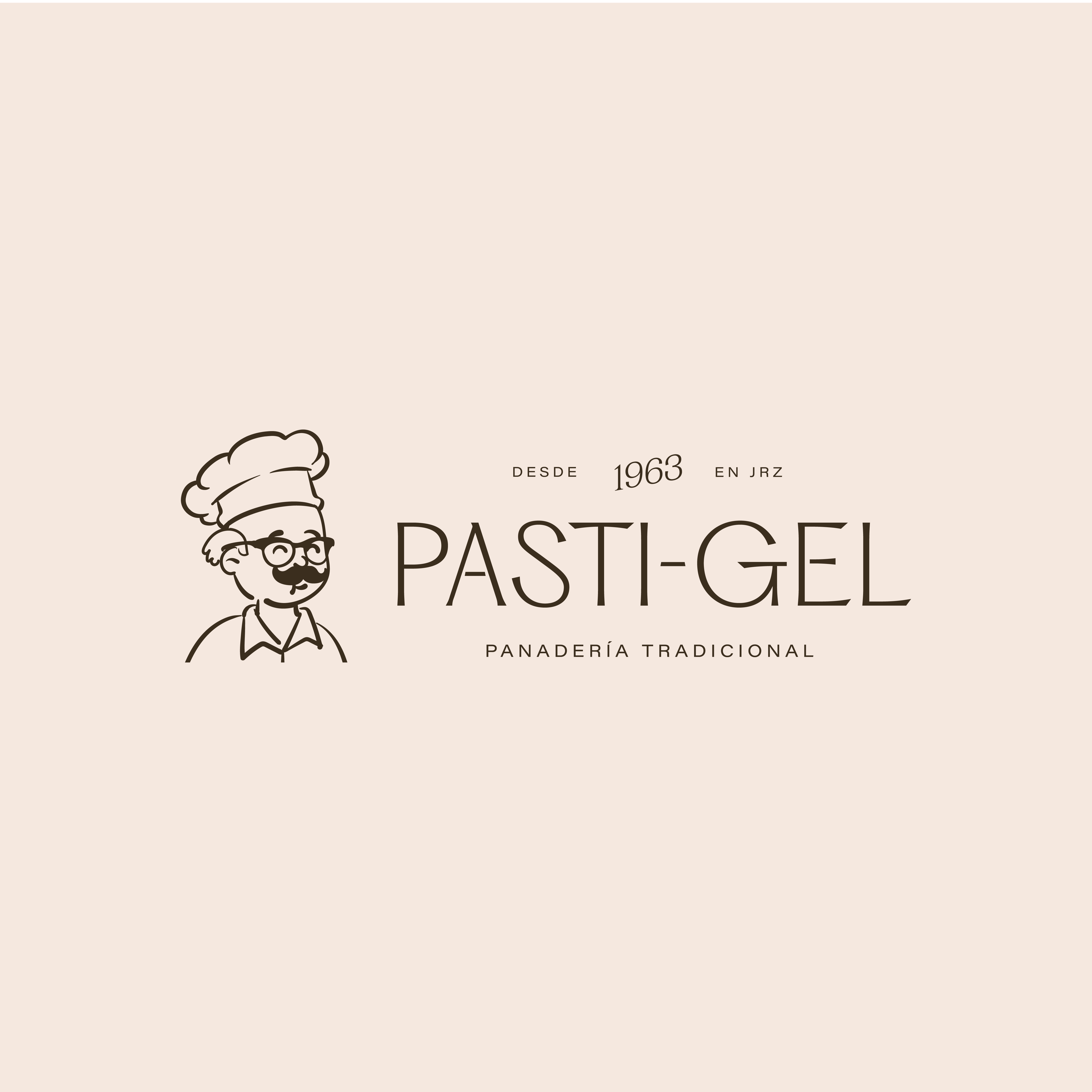
TAHONA
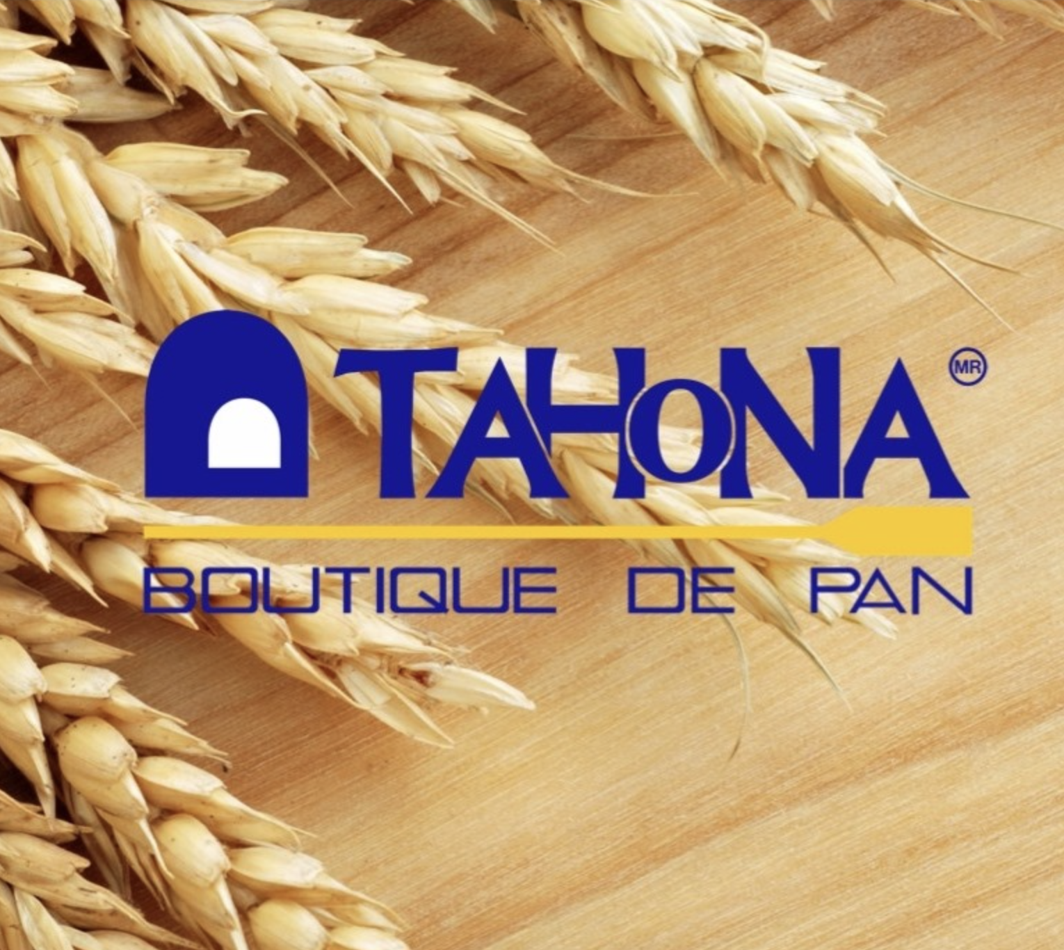
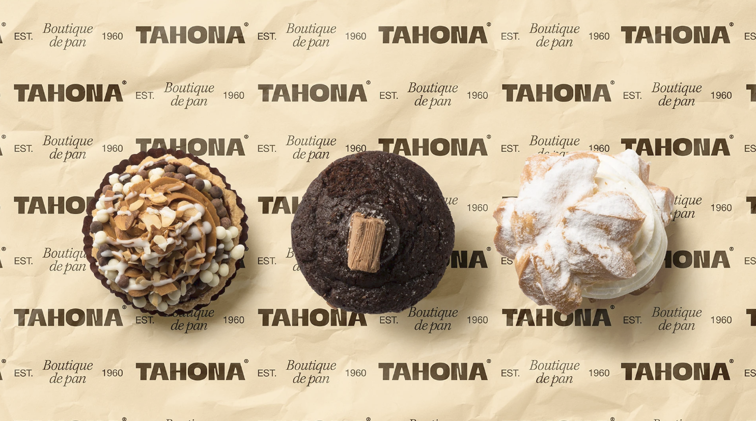
Es una panadería que existe desde 1960 en la Ciudad de México, elaboran pan artesanal tradicional mexicano por maestros panaderos. Formas, nombres, colores, aromas y sabores que recorren su historia y les dan identidad, reafirmando sus raíces, con calidad y orgullo, su pan sabe a México.
¿Porque nos buscaron?
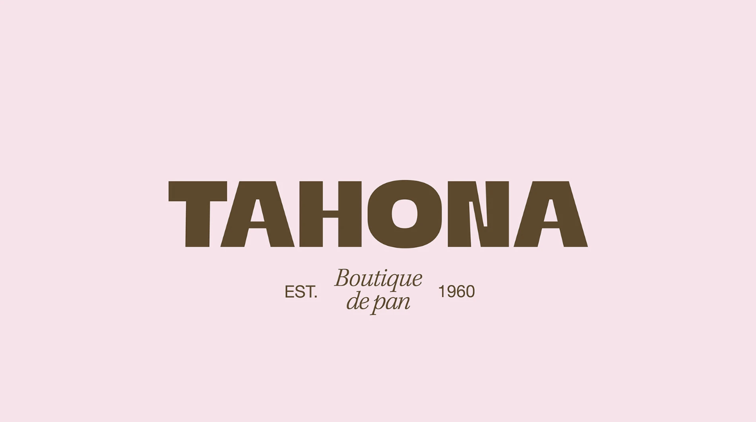
Querían conectar con un nuevo mercado más exclusivo ya que buscaban convertirse en una boutique de pan conservando la esencia tradicional de la marca pero evolucionar como una marca más vanguardista. Además no tenían consistencia visual para todo su material gráfico.
¿Qué hacemos con ellos?
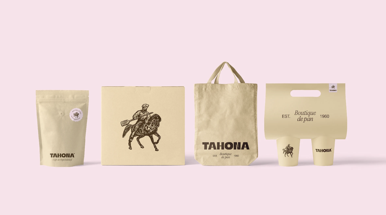
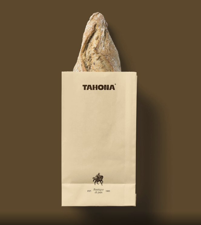
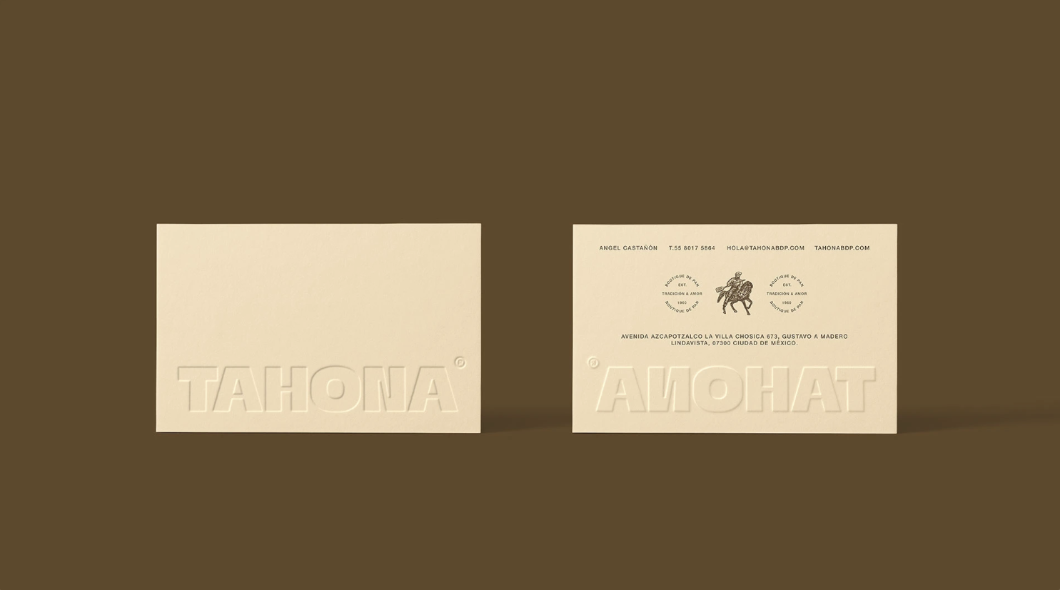
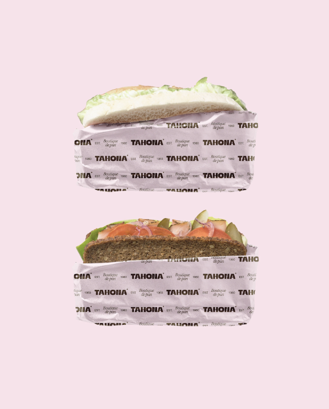
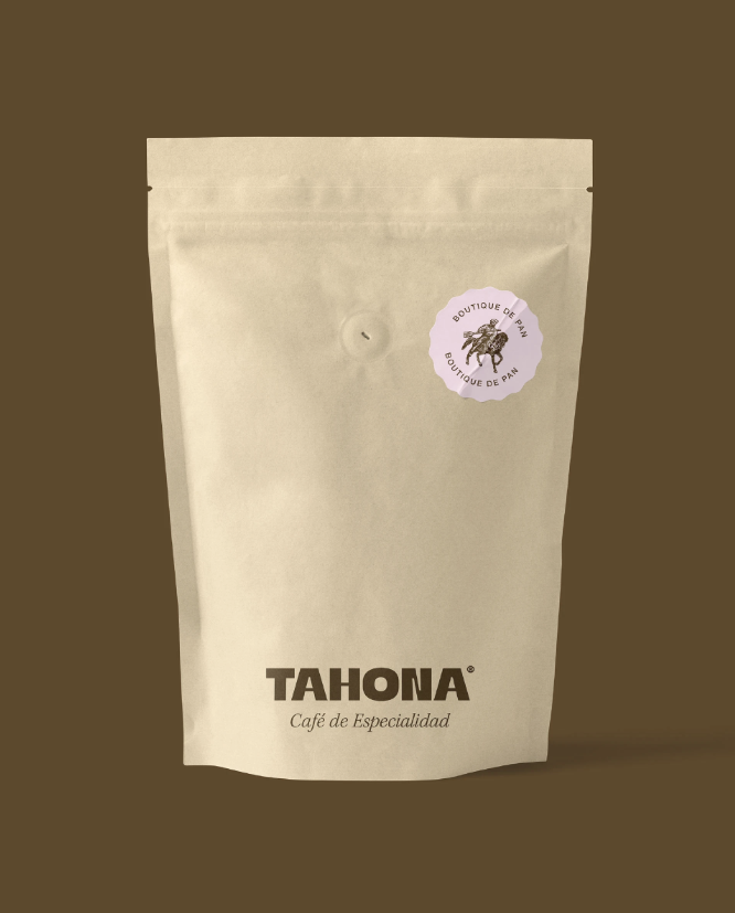
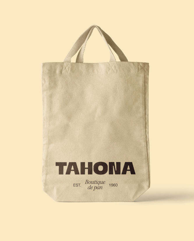
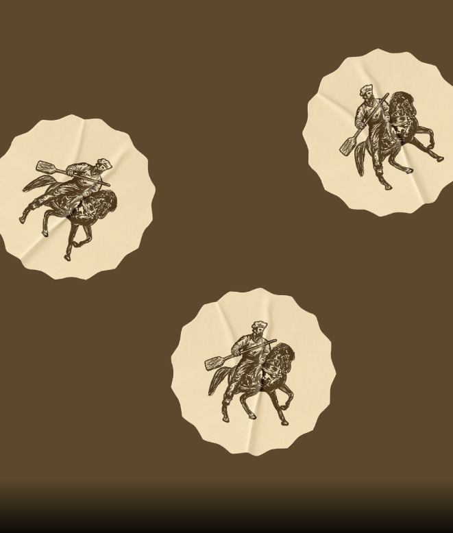
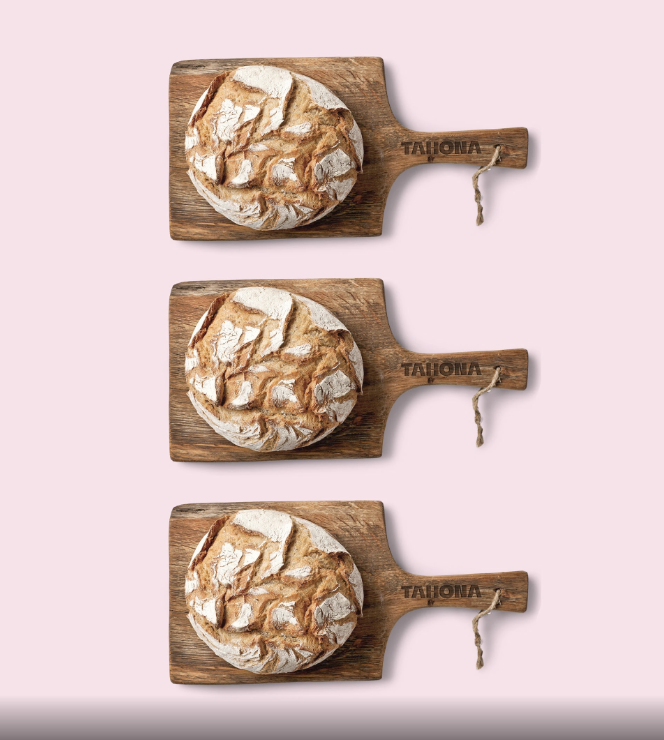
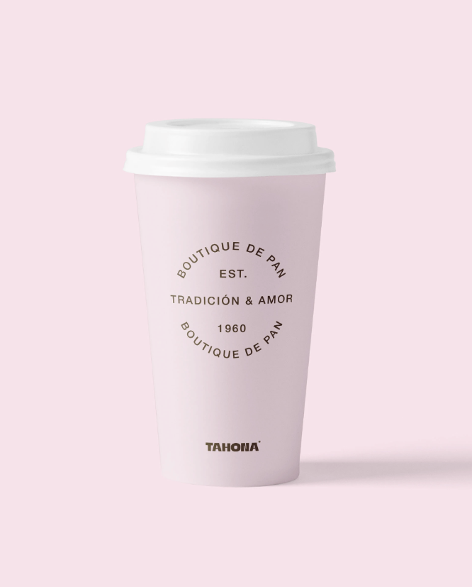
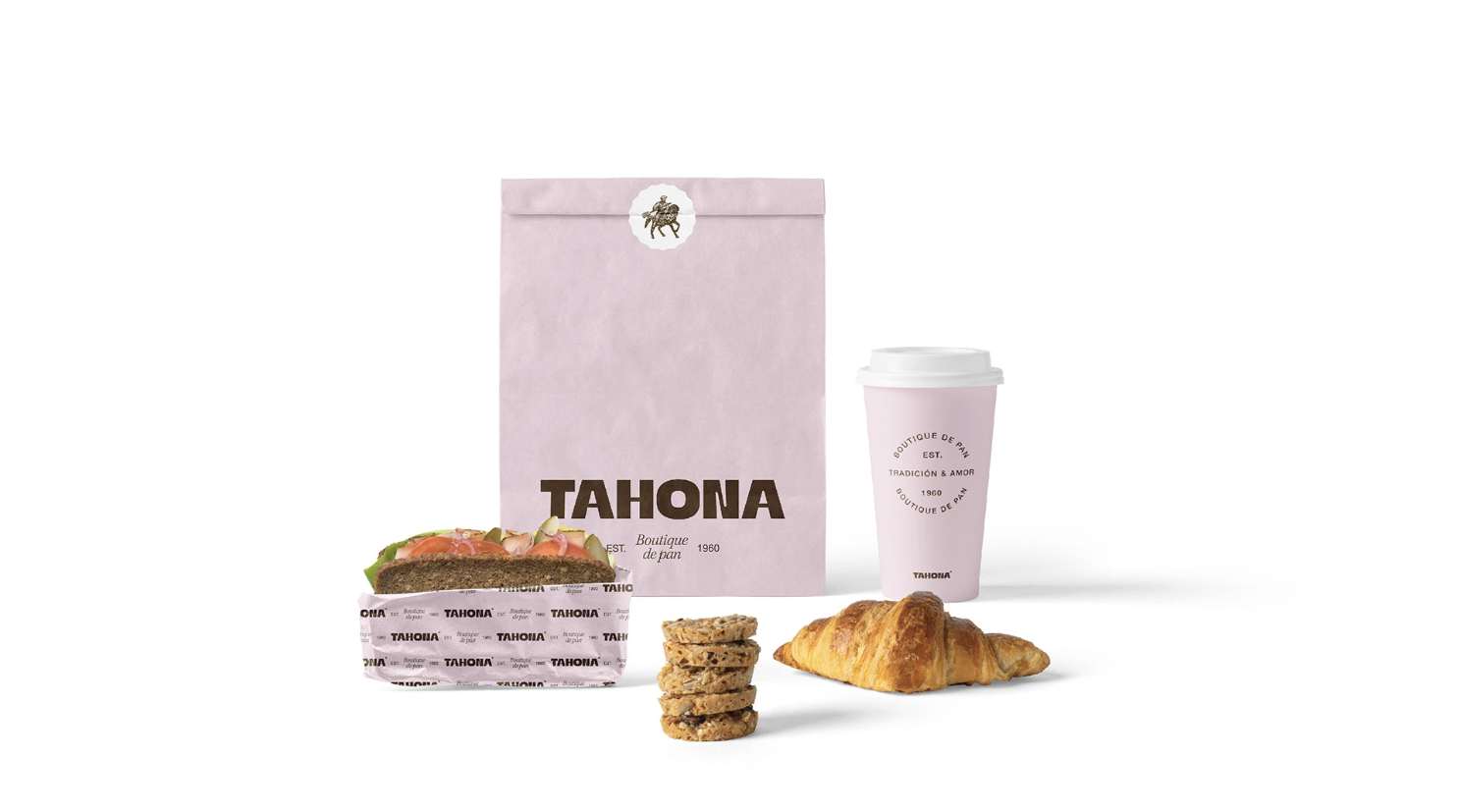
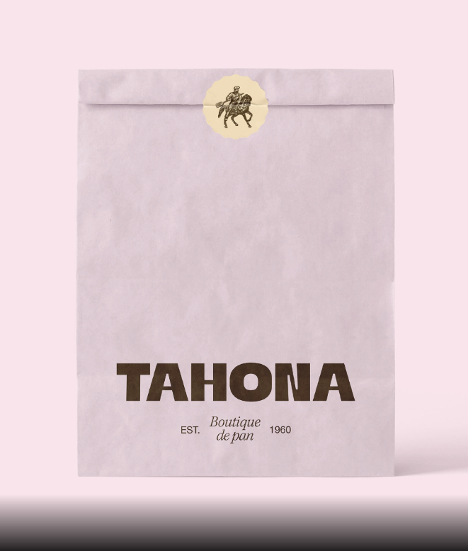
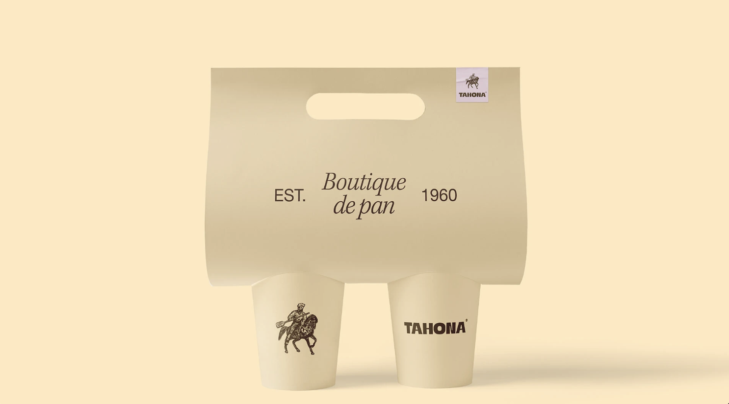
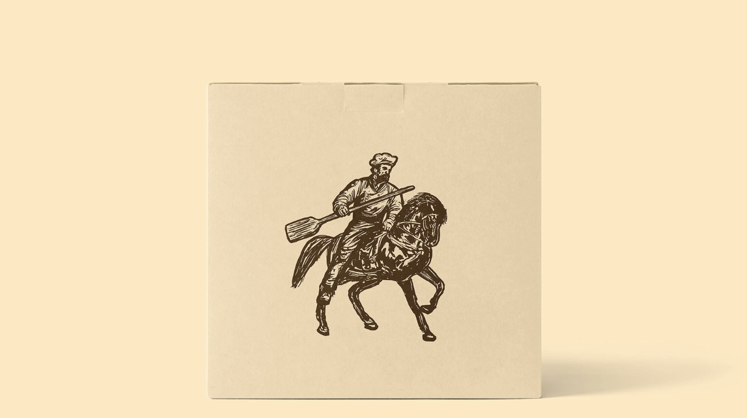
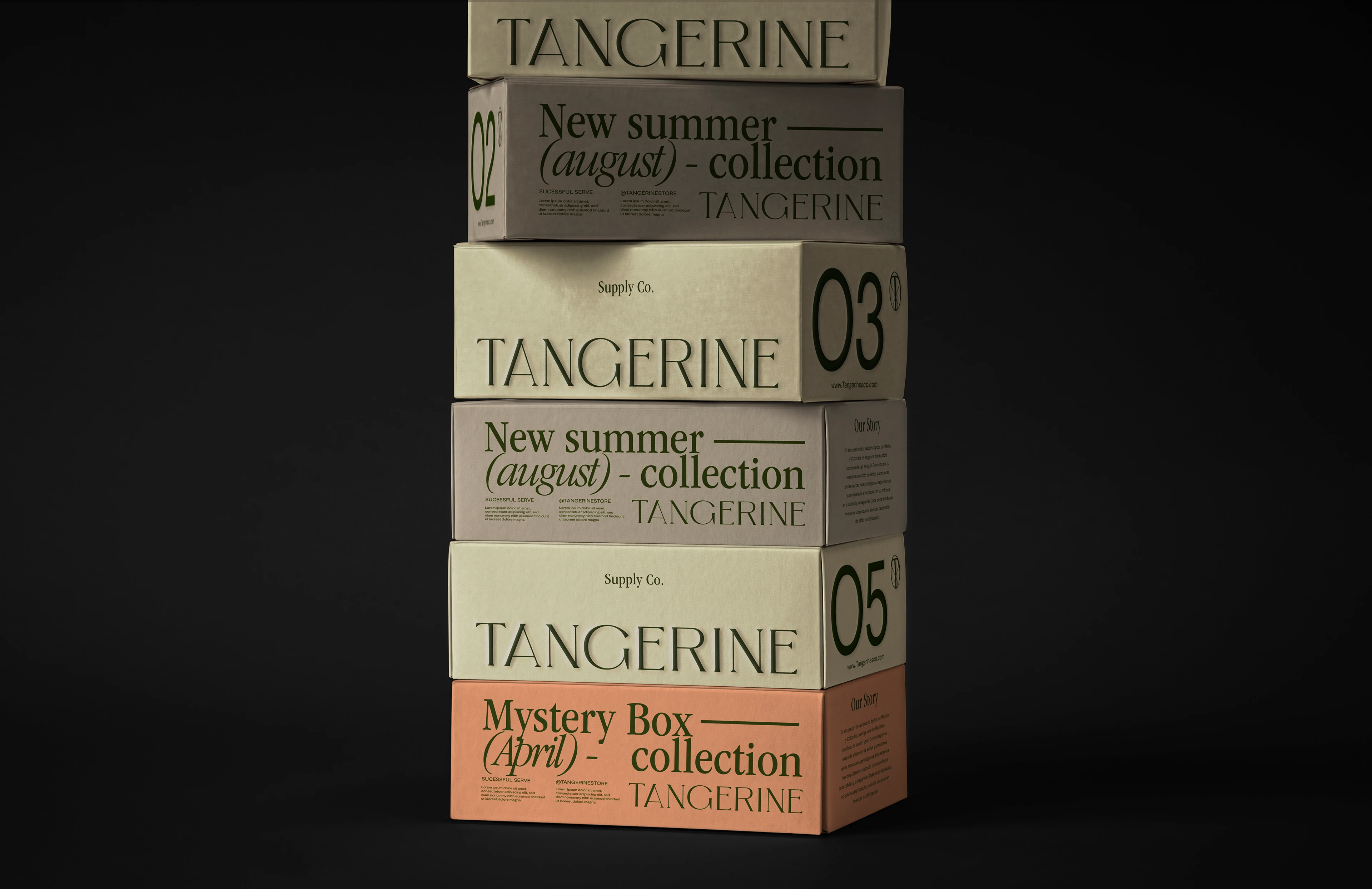
Rediseño de identidad visual que incluye logo, ilustración, empaques de cajas, bolsas de papel, portavasos de café para llevar, vasos de café, papel para envolver, empaque de café, tarjetas, etc.
Resultados
Percepción de los clientes como una panadería boutique que conecta con un mercado de nivel socioeconómico más alto y que conserva la esencia tradicional de la marca.
Vea lo que dijo nuestro cliente
"Tahona logró evolucionar sin perder su esencia. Ahora es una panadería boutique que honra su tradición con una imagen sofisticada."
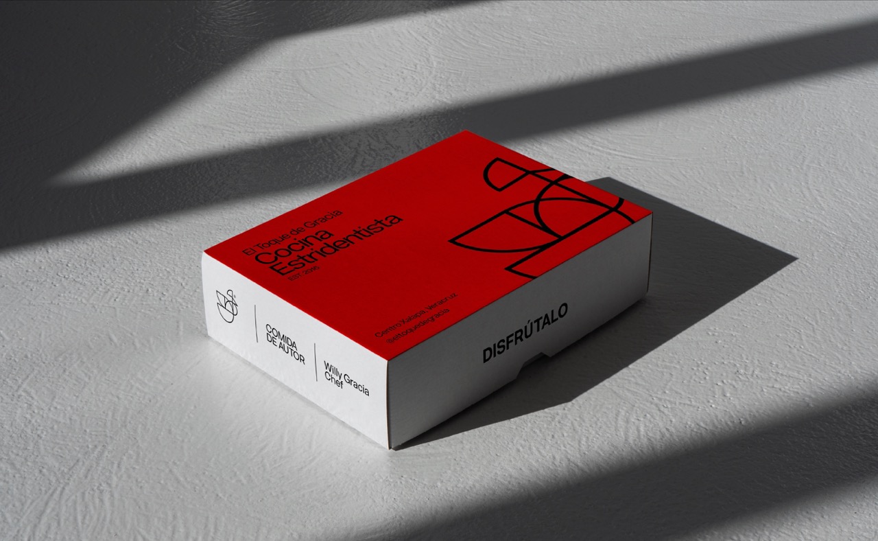
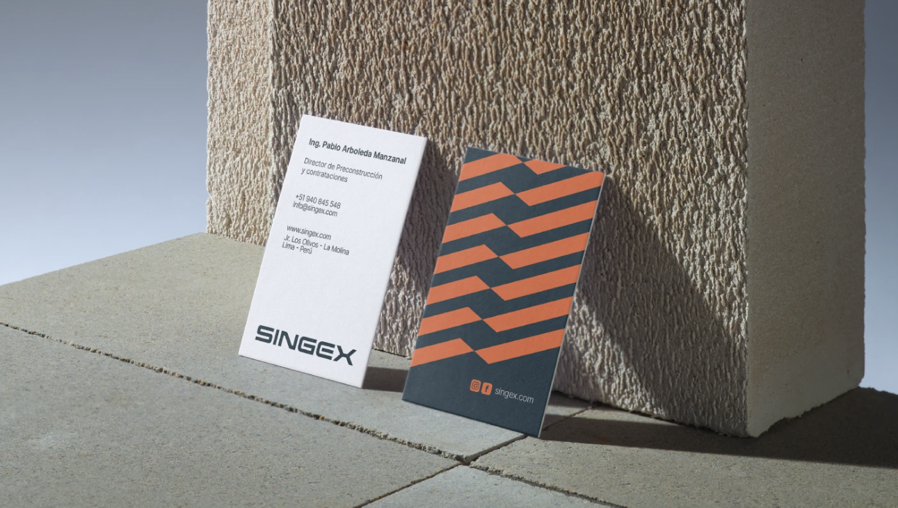
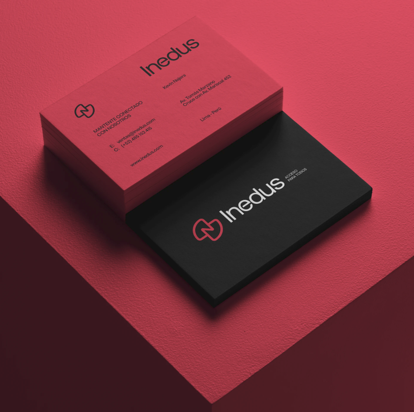
Nuestra cartera habla por sí sola
Nuestra experiencia en diseño gráfico
Explora el trabajo que hemos realizado para nuestros increíbles socios y clientes.


.jpg)

%206.57.24%E2%80%AFp.m.%20Large.jpeg)


¿Listo para transformar tu marca?
Reserva una asesoría gratuita por videollamada o llena nuestro formulario para platicar más de tu marca y explicarte el proceso creativo.